

Line Chart
To create a Line chart Widget that displays information as a series of data points connected with straight line segments.
Industrial use case and scenario:
Monitoring hourly production trends is vital for identifying inefficiencies and maintaining consistent output. A line chart is particularly effective for this purpose, as it clearly illustrates fluctuations in production rates over time. By visualizing these trends, a manufacturing facility can quickly detect anomalies, such as sudden drops or spikes, which may indicate potential bottlenecks, equipment issues, or staffing imbalances. This real-time insight enables timely interventions, supports data-driven decision-making, and helps optimize overall production efficiency.
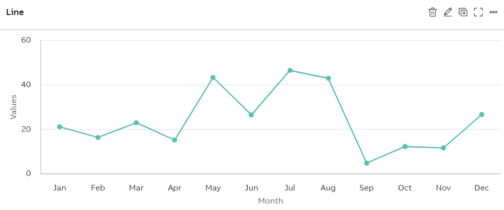
Line Chart
Configuration Options
To learn about common configuration options, refer to the following topics from the Edit Widgets section:
|
Label |
Description |
|
DataSource |
See DataSource |
|
Events |
See Events |
|
Link |
See Link |
|
Expressions |
See Expressions |
|
Alias |
See Alias |
|
Help |
See Help |
|
Refresh |
See Refresh |
Styles
On the Styles tab, add the following details to create the Line Chart Widget:
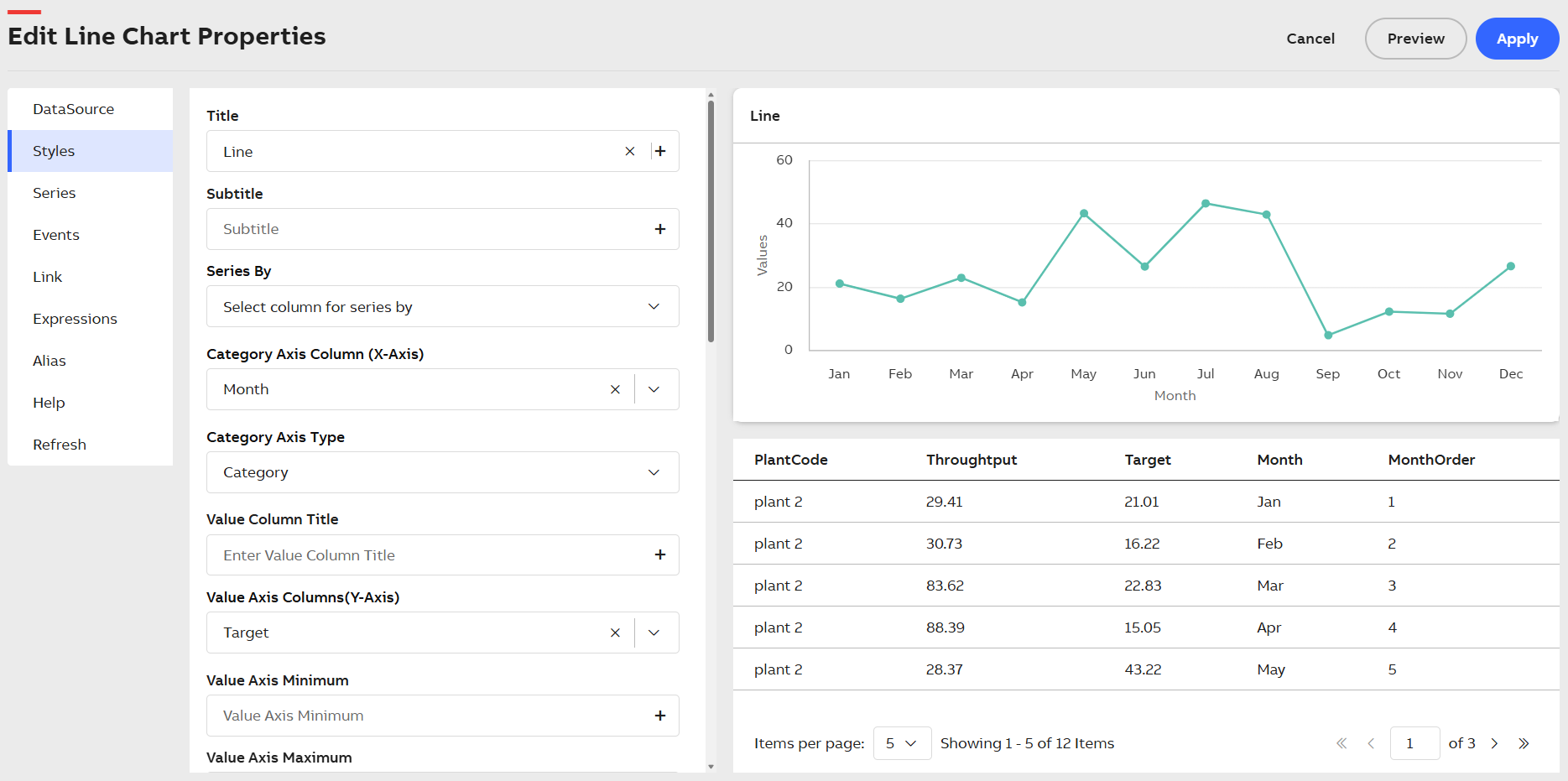
Styles Tab
|
Field |
Description |
|
Title |
Title or Label of the widget to be displayed in the dashboard. You can either enter the title manually or click the + icon to open the Parameter Value Configuration pop-up and select the name. For more information, see Variable Usage. |
|
Subtitle |
Enter a short description of the KPI represented in the widget. It will be displayed below the chart title. You can either enter the subtitle manually or click the + icon to open the Parameter Value Configuration pop-up and select the name. For more information, see Variable Usage. |
|
Series by |
Choose from the list of columns to group the data accordingly and display them in series. |
|
Generate Multiple Value Axis |
Select the checkbox to create multiple Value Axes in the chart. |
|
Category Axis Column(X-Axis) |
Choose from the dropdown to assign data to the Category Axis (X-axis). |
|
Category Axis Type |
From the dropdown list, choose the data type of the Category Axis Column. |
|
Value Column Title |
Displays the Value Axis Title. You can either manually enter the name for Value Column Title or click the + icon to generate the Parameter Value Configuration pop-up and select the name. For more information, see Variable Usage. |
|
Value Axis Columns(Y-Axis) |
Choose from the dropdown to assign data to the Value axis (Y-axis). |
|
Value Axis Minimum |
The value axis is the Y-axis. This field allows you to specify the minimum range for the Y-axis. You can enter the value manually or click the + icon to select a value using the Parameter Value Configuration. For more information, see Variable Usage. |
|
Value Axis Maximum |
The value axis is the Y-axis. This field allows you to specify the maximum range for the Y-axis. You can enter the value manually or click the + icon to select a value using the Parameter Value Configuration. For more information, see Variable Usage. |
|
Value Axis Soft Range |
The system applies hard range by default for the value axis (Y-axis). If a plot value is greater than the hard range, then the chart automatically truncates that value. If you enable the Value Axis Soft Range checkbox, then the range adjusts itself based on data. |
|
Unit Of Measurement For Value Axis |
Displays the unit of measurement of value axis on the axis title. You can either manually enter the value for Unit Of Measurement For Value Axis or click the + icon to generate the Parameter Value Configuration pop-up and select the value. For more information, see Variable Usage. |
|
Stacking |
Select a type of Stacking from the dropdown list:
|
|
Inverted |
Select the checkbox to invert the chart as Category Axis Column becomes Y-Axis and Value Axis Columns becomes X-Axis. |
|
Legend |
Select the checkbox to display Legends in the Widget. |
|
Align |
Choose from dropdown to place the legend either on left, center or right of plot area. |
|
Vertical Align |
Choose from dropdown to place the legend either on ltop, middle or bottom of plot area. |
|
Layout |
Choose from dropdown to list the legend either horizontally, vertically or proximately in plot area. |
|
Data Label |
Enable the Data Label checkbox to display numerical values directly above each data point on the chart. Once enabled, additional customization options appear:
|
|
Zoom |
The Zoom dropdown allows you to control zooming behavior on the plot. You can select from the following options:
|
|
Step |
Select the checkbox to display the line connecting the data points as steps. |
|
Step Properties |
Select from the dropdown (Left, Right, and Center) to define the position of the data points on the line. |
|
Custom ID |
The value in this field gets automatically filled out by the dashboard. This field helps to identify the widgets while configuring events. This can be user-defined as well. |
|
Export CSV |
Enable this checkbox to download the information available in the line chart in CSV format. |
|
Export JPEG |
Enable this checkbox to export in JPEG format. |
|
Export PNG |
Enable this checkbox to export in PNG format. |
|
Zooming pane window |
Enable this checkbox to render the moving pane features for a widget. You can enable the Zooming pane window feature only if the Category Axis (X-axis) value is set as DateTime. |
|
Plot Lines |
Plot lines are an array of components used for plotting lines in Line chart. Plot lines are always plotted taking the Value Axis (Y-axis) as reference. Plot Lines consists of the following fields:
|
|
Plot Bands |
Plot bands are used to highlight specific areas or ranges on a chart, helping to draw attention to certain values or periods. For example, you can highlight a safe operating range for a machine or emphasize a threshold that must not be exceeded. Plot bands consists of following fields:
|
|
Tooltip |
To configure tooltips in the plot, click the +Tooltip option. This lets you define multiple custom tooltips that appear when hovering over data points. Once you click +Tooltip, additional configuration fields appear:
The columns shown in the tooltip or data table are dynamic and vary based on the dataset retrieved from KSH. |
|
Tooltip Display Mode |
Use the Tooltip Display Mode dropdown to control how tooltips appear on the plot. Choose from the following modes:
|
|
Borderless Header |
Enable this checkbox to hide the border of the title. |
|
Frameless |
Enable this checkbox to hide the frame around the widget. |
|
Fullscreen |
Enable this checkbox to view the widget in full-screen mode. |
Series
Series tab is introduced newly under Edit Widget Properties. The Series is an array of components useful for configuring the line series trend.
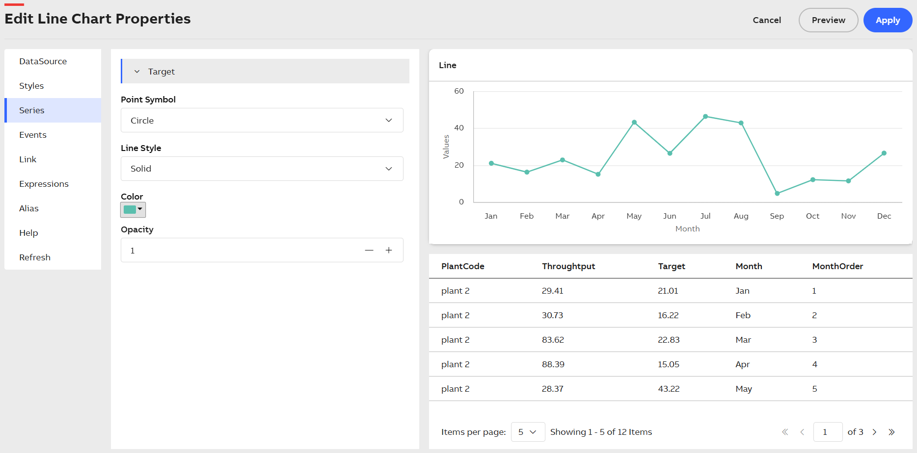
Series Tab
The Series tab consists of the following fields:
|
Field |
Description |
|---|---|
| Point Symbol |
This field displays every point in the Line chart using symbol marker. Click the dropdown menu and select a symbol type. Click the dropdown menu and select any one from the available options. For example, Triangle, Circle, Square. |
| Line Style |
This field allows you to select different styles for the Plot Lines. Click the dropdown menu and select any one from the available options. For example, Solid, Dot, Dash, LongDash. If No-Line is selected, then series will be displayed only with points. |
| Color |
Allows you to select color for the configured plot line. Click the dropdown menu and select the required color. |
| Opacity |
Allows you to define the opacity value of the color for the selected series. It is a numeric field type. |
The Line Chart allows to plot up to 100000 data points as per your business requirements. This enables you to plot real time data of many days and weeks together in the chart.